"Ring sizer"
- Ring band measurement tool.
(Uniqo Lab).
Case Study analysis of Usability Evolution.
Case Study analysis of Usability Evolution.
UX/UI Designer
Application
Fig Jam, Figma
2 weeks
Introduction
Being associated with a
jewelry design, I know some nuances that exist. One of
them is determining the appropriate
ring size
for a customer when it comes to
online sales.
This leads to errors when ordering and disappointment in buying jewelry online. Redarding the
Research
i did -

User study
Understanding user behavior is essential for creating a product that meets their needs and expectations. Insights from
user research can provide valuable context for design decisions and help address user motivations.
To better understand, let’s examine the user research insights: 64% of customers are actually looking for a gift. This finding sheds light on user intent, revealing that a significant portion of the audience is seeking a product not for personal use, but for gifting purposes.
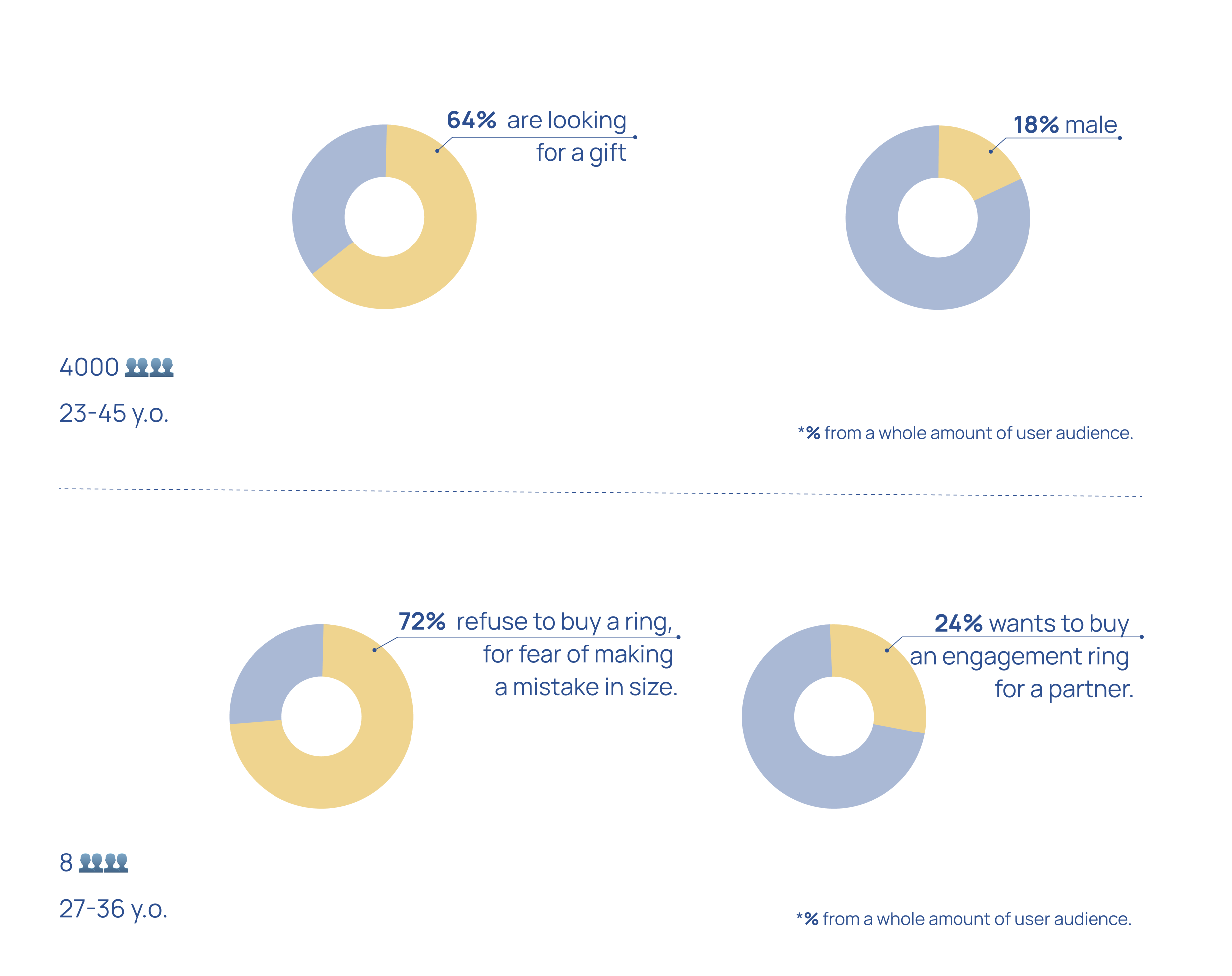
72% of customers hesitate to buy a ring due to fear of choosing the wrong size, leading them to opt for other goods instead. This highlights a major concern that affects their purchasing decisions. However, 24% of users are specifically searching for an engagement ring for their partner, showing a clear segment of customers with a strong intent but likely facing the same sizing hesitation.
These insights suggest the need to focus on providing solutions that help users confidently select the right ring size, especially for those purchasing engagement rings. Addressing this fear of error could significantly reduce friction in the purchasing process, improving conversions and user satisfaction.
I took the original application that existed on the market for a long time “Ring sizer” from Uniqo Lab., and proposed my own solutions in the field of usability.
To better understand, let’s examine the user research insights: 64% of customers are actually looking for a gift. This finding sheds light on user intent, revealing that a significant portion of the audience is seeking a product not for personal use, but for gifting purposes.

72% of customers hesitate to buy a ring due to fear of choosing the wrong size, leading them to opt for other goods instead. This highlights a major concern that affects their purchasing decisions. However, 24% of users are specifically searching for an engagement ring for their partner, showing a clear segment of customers with a strong intent but likely facing the same sizing hesitation.
These insights suggest the need to focus on providing solutions that help users confidently select the right ring size, especially for those purchasing engagement rings. Addressing this fear of error could significantly reduce friction in the purchasing process, improving conversions and user satisfaction.
I took the original application that existed on the market for a long time “Ring sizer” from Uniqo Lab., and proposed my own solutions in the field of usability.
Original Application analysis
User testing is a valuable tool for identifying challenges users face while interacting with a product. Through
moderated user testing, we can uncover areas that need improvement to enhance the overall user experience.
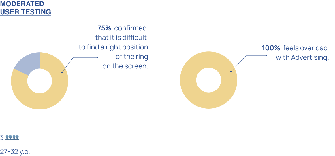
During moderated user testing, I discovered that 75% of users are struggling to find the correct position for the ring on the screen. This difficulty highlights a significant issue in the interface, where users are unsure how to accurately position the ring for measurement or selection, creating friction in the user journey.
In the same moderated user testing, it was found that 100% of users feel overwhelmed by the amount of advertising within the application. This saturation of ads detracts from their overall experience, making it challenging for users to focus on the core functionalities of the product. This overwhelming feeling highlights the need to reevaluate the advertising strategy within the application. Reducing the volume and frequency of ads, or strategically placing them in less intrusive ways, could significantly improve user engagement and satisfaction, allowing users to navigate the application more comfortably.
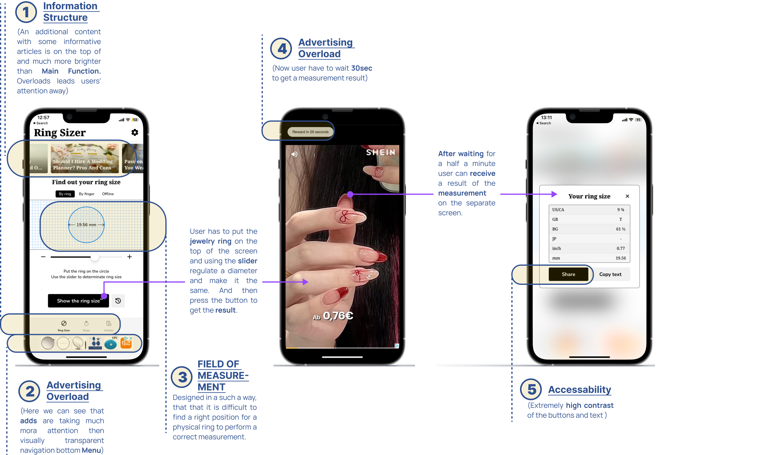
In the image below, you can see a brief overview of the key factors that impact the
User Juorney
within the main User Flow.
Each of these factors has been diagnosed and evaluated based on
Usability Heuristic and Accesability Rules.
ensuring that the user experience is both intuitive and inclusive.
By identifying and analyzing these factors, we can refine the user flow to create a smoother and more accessible experience, ensuring the product is user-friendly and meets the necessary compliance standards.
By identifying and analyzing these factors, we can refine the user flow to create a smoother and more accessible experience, ensuring the product is user-friendly and meets the necessary compliance standards.

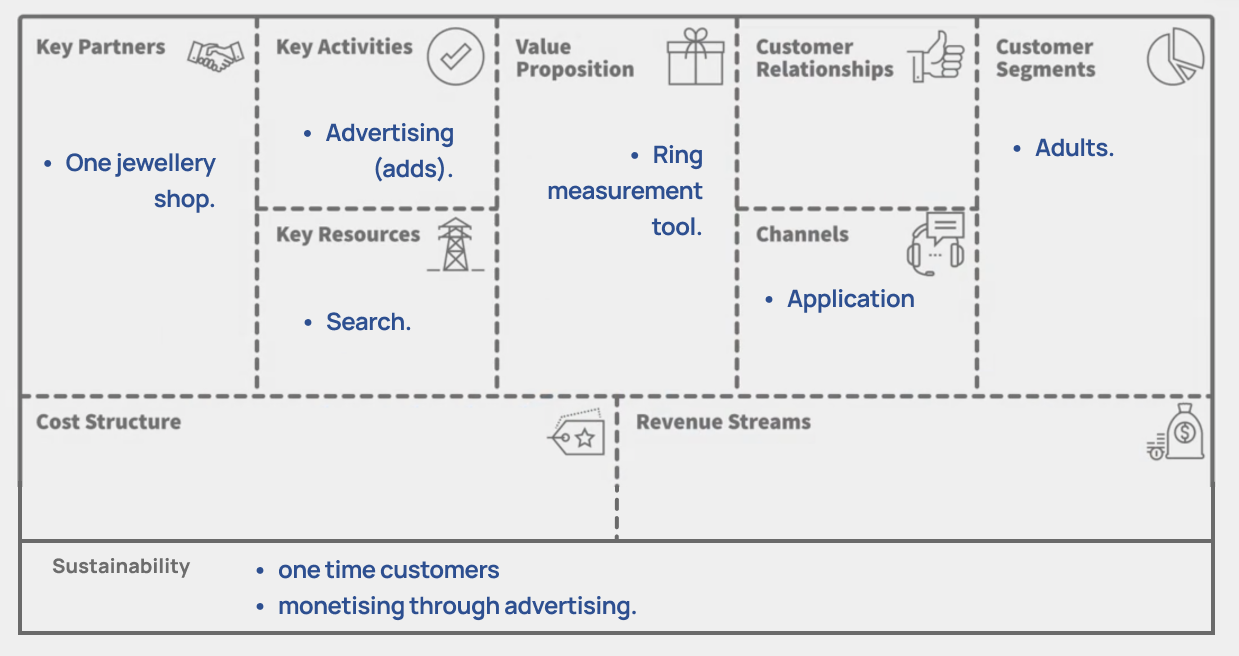
Original Product Business model analyses
Original App user journey analyses
User experience is deeply intertwined with emotional responses, and understanding these emotions is critical for
refining the design of an application. By analyzing user journeys, we can uncover how specific interactions shape users'
feelings throughout their experience.
After conducting interviews with an expert and testing the RingSizer App with real users, I developed the original app's User Journey to illustrate how various aspects of the app affect users' emotions.
After conducting interviews with an expert and testing the RingSizer App with real users, I developed the original app's User Journey to illustrate how various aspects of the app affect users' emotions.

This journey highlights key
touchpoints where users experience positive or negative emotions, such as:
Initial Interaction: Users often feel excitement or
anticipation when first engaging with the app, as they are eager to
find the perfect ring.
Navigating Features: As users explore the app’s
functionalities, confusion or frustration may arise, especially if they
struggle to find the right position for the ring on the screen.
Measurement Process: During the measurement process, users
may feel anxious about making mistakes, particularly
regarding sizing, which can lead to feelings of overwhelm or uncertainty.
Frustration from Incorrect Final Result: If the final
measurement result is inaccurate, users experience frustration and
disappointment, which can diminish their trust in the app.
Solution in field of usability
The way we present information in an application is crucial for usability and overall user experience. While certain
functions are necessary, their placement and accessibility within the user interface need careful consideration to
maintain a smooth flow.
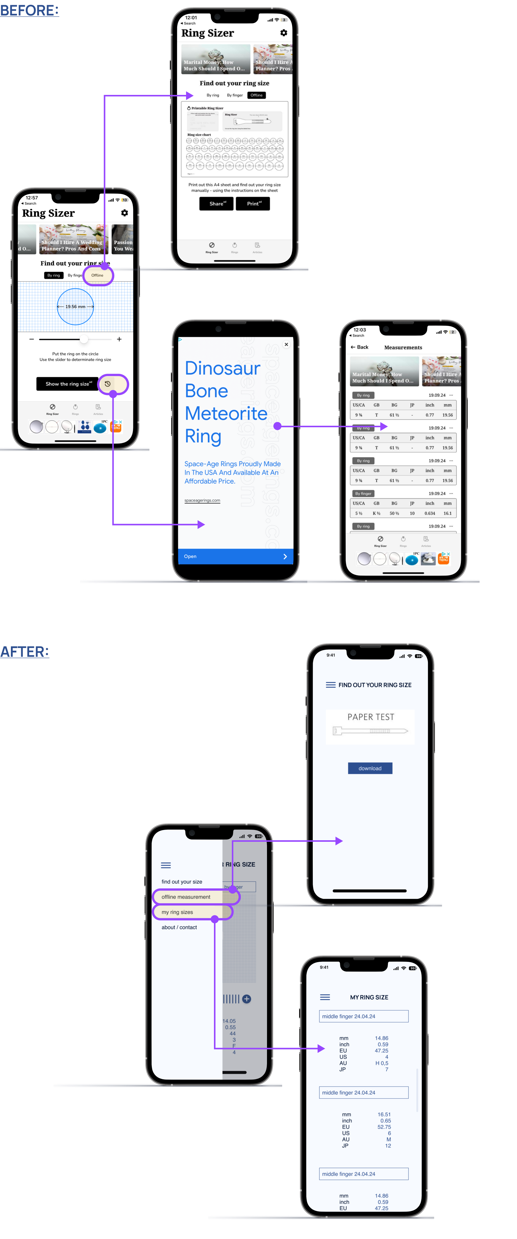
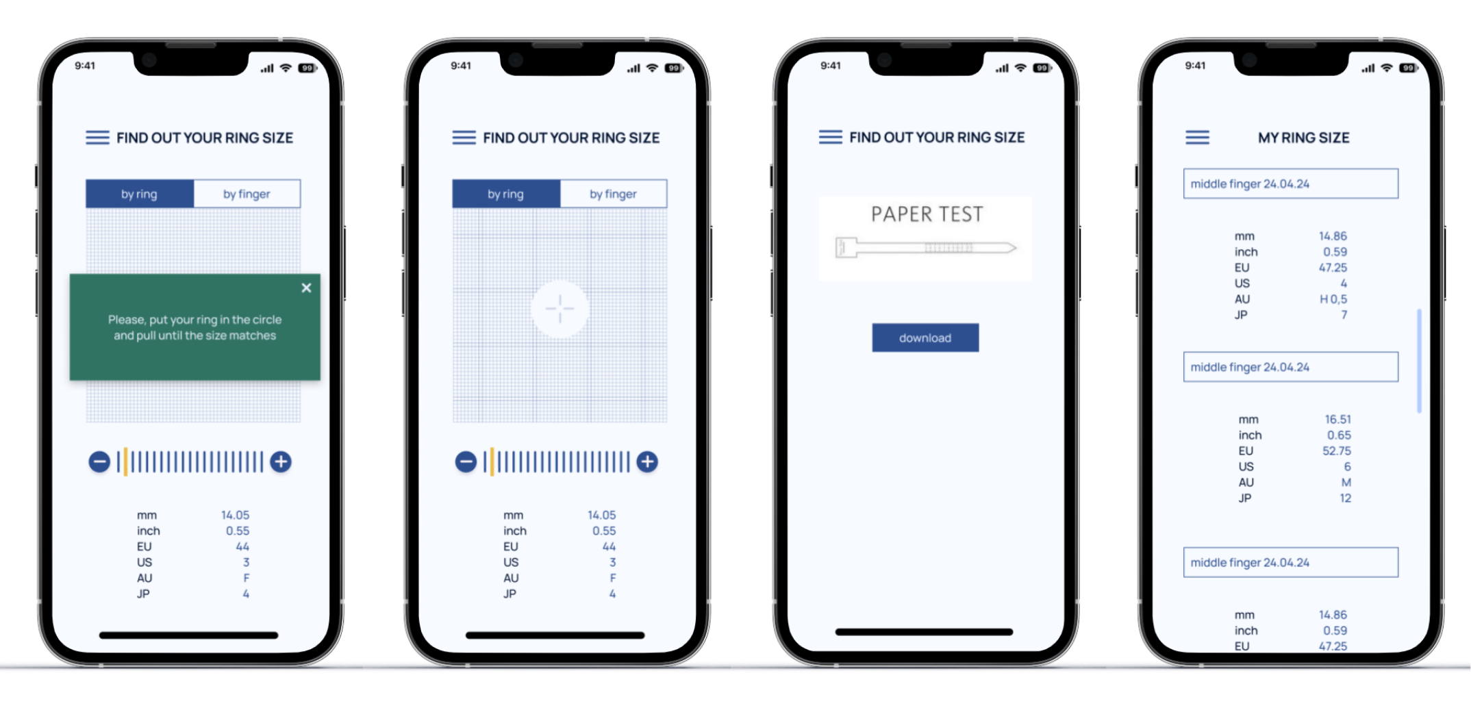
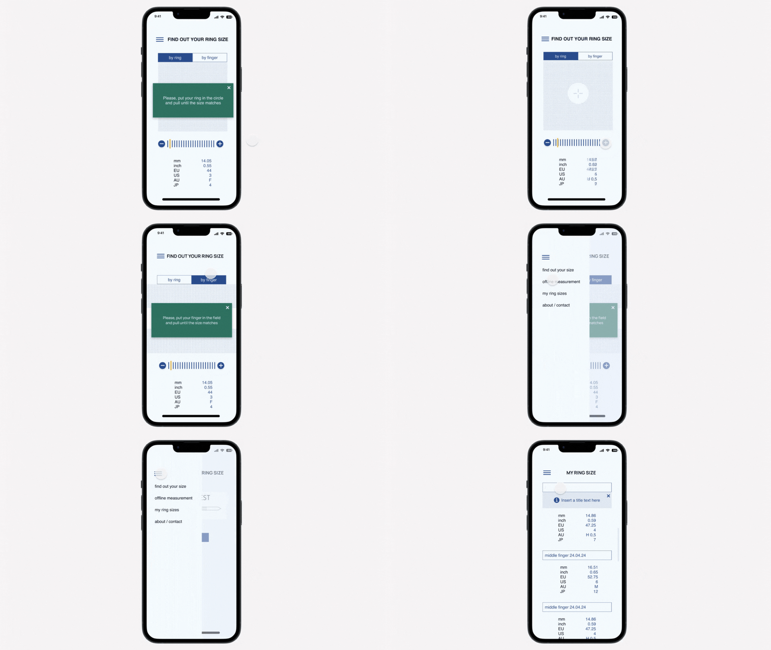
In this case, the physical measurement function is the most accurate and essential part of the application. However, its prominent display disrupts the application's information structure, making the interface feel cluttered or overwhelming. To resolve this issue, the function has been moved to the Hamburger menu, a location that allows users to access it without interfering with the main flow of the application.
Additionally, the Hamburger menu now includes a list of saved data from previous measurements, ensuring that users can easily retrieve past information without cluttering the main interface. This not only preserves the application's streamlined design but also enhances its practicality.
By relocating the physical measurement function and associated data to the Hamburger menu, the application's usability is improved, keeping the main interface clean and ensuring that essential functions remain easily accessible when needed.
Enhancing the accuracy of measurements is a key aspect of improving user experience and ensuring the system effectively meets real-world needs. In line with usability principles, design changes can make a significant difference in how users interact with the system.
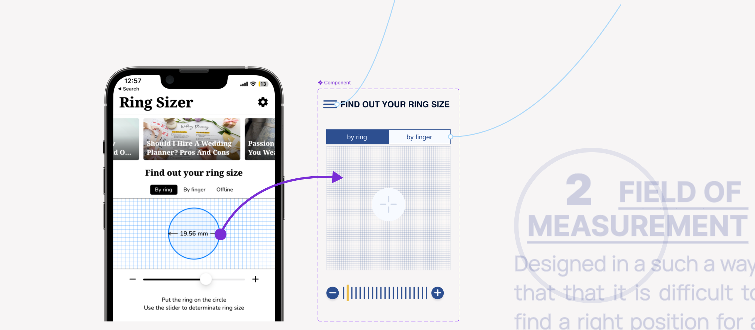
To improve the accuracy of the measurements, I introduced a visual enhancement where the area inside the circle of the ring is now filled with a distinct color. This allows users to take measurements more effectively, regardless of the ring's thickness, ensuring that the tool adapts to various scenarios. Additionally, the ring has been equipped with a center mark, guiding the user to place it precisely on the measurement target.
This design change follows Usability Heuristic #2 - Match Between the System and the Real World, ensuring that the system aligns with how users expect it to function in practical, real-world conditions.
User interface design plays a crucial role in ensuring users have a smooth, intuitive experience. Streamlining the user path can prevent frustration, build trust, and give users more control over their interactions with the system.
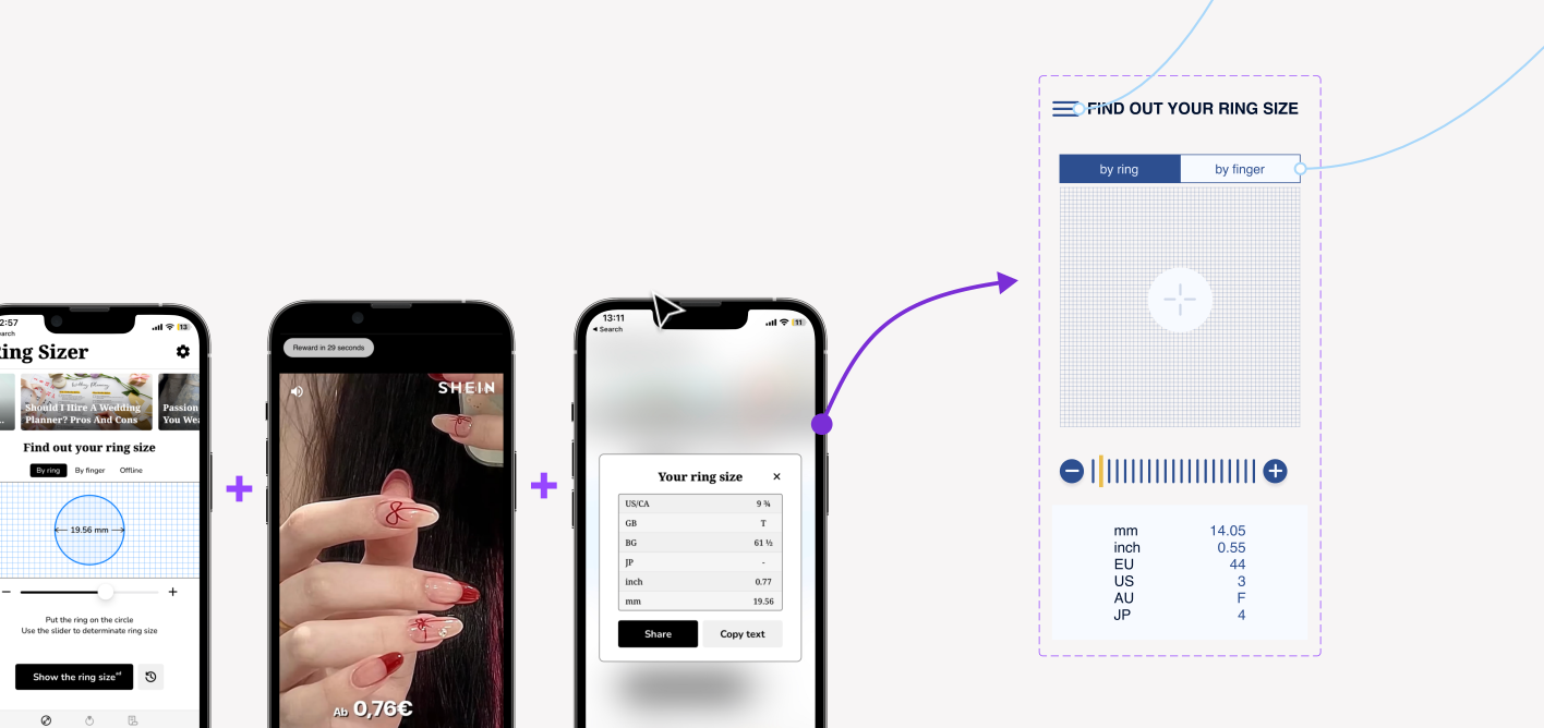
I revised the UI, modifying the user flow by moving the “Measurement Results” to appear directly on the same screen. This change eliminates the need for users to navigate to a separate page, where they were previously required to watch 30-second paid ads before seeing their results. By delivering the expected outcome immediately, the update enhances the user experience.
This adjustment aligns with Usability Heuristic #3 – User Control and Freedom, ensuring that users feel in control of the product without being forced into unnecessary delays or distractions. It also helps build trust by removing frustrating roadblocks and providing a more seamless interaction.
By relocating the measurement results to the same screen and removing disruptive ads, the product now offers a more user-friendly and transparent experience. This gives users greater freedom and control, fostering a stronger sense of trust and satisfaction with the application.
Accessibility is a crucial aspect of design, ensuring that applications are usable by everyone, including those with visual impairments or cognitive differences. Following WCAG (Web Content Accessibility Guidelines) standards is essential for creating an inclusive digital experience.
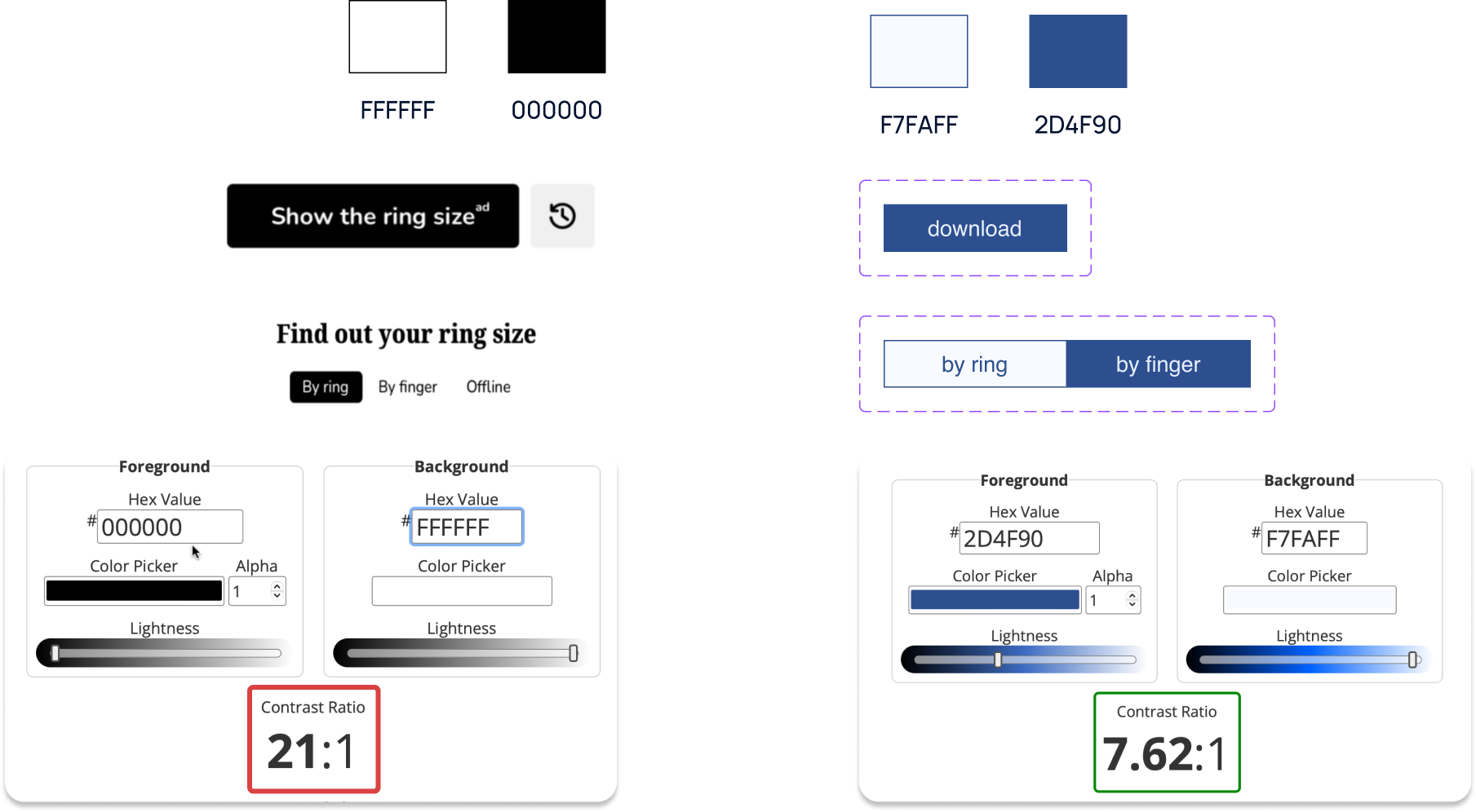
To achieve the highest level of WCAG compliance, it's important to aim for a text contrast ratio of 7:1, which ensures readability for users with visual impairments. In the original app, the current contrast level is significantly higher at 21:1, which can actually create issues for certain users, such as those with astigmatism or autism, who may find it overwhelming or difficult to process.
Reducing the contrast ratio to the recommended level not only improves WCAG compliance but also makes the application more user-friendly for individuals with specific needs. This adjustment supports accessibility goals and contributes to a better, more equitable digital experience for all users. Right solution is to reduce it and to make lives of people with Astigmatism or Autismus easier.
In this case, the physical measurement function is the most accurate and essential part of the application. However, its prominent display disrupts the application's information structure, making the interface feel cluttered or overwhelming. To resolve this issue, the function has been moved to the Hamburger menu, a location that allows users to access it without interfering with the main flow of the application.
Additionally, the Hamburger menu now includes a list of saved data from previous measurements, ensuring that users can easily retrieve past information without cluttering the main interface. This not only preserves the application's streamlined design but also enhances its practicality.
By relocating the physical measurement function and associated data to the Hamburger menu, the application's usability is improved, keeping the main interface clean and ensuring that essential functions remain easily accessible when needed.

Enhancing the accuracy of measurements is a key aspect of improving user experience and ensuring the system effectively meets real-world needs. In line with usability principles, design changes can make a significant difference in how users interact with the system.
To improve the accuracy of the measurements, I introduced a visual enhancement where the area inside the circle of the ring is now filled with a distinct color. This allows users to take measurements more effectively, regardless of the ring's thickness, ensuring that the tool adapts to various scenarios. Additionally, the ring has been equipped with a center mark, guiding the user to place it precisely on the measurement target.
This design change follows Usability Heuristic #2 - Match Between the System and the Real World, ensuring that the system aligns with how users expect it to function in practical, real-world conditions.

User interface design plays a crucial role in ensuring users have a smooth, intuitive experience. Streamlining the user path can prevent frustration, build trust, and give users more control over their interactions with the system.
I revised the UI, modifying the user flow by moving the “Measurement Results” to appear directly on the same screen. This change eliminates the need for users to navigate to a separate page, where they were previously required to watch 30-second paid ads before seeing their results. By delivering the expected outcome immediately, the update enhances the user experience.
This adjustment aligns with Usability Heuristic #3 – User Control and Freedom, ensuring that users feel in control of the product without being forced into unnecessary delays or distractions. It also helps build trust by removing frustrating roadblocks and providing a more seamless interaction.
By relocating the measurement results to the same screen and removing disruptive ads, the product now offers a more user-friendly and transparent experience. This gives users greater freedom and control, fostering a stronger sense of trust and satisfaction with the application.

Accessibility is a crucial aspect of design, ensuring that applications are usable by everyone, including those with visual impairments or cognitive differences. Following WCAG (Web Content Accessibility Guidelines) standards is essential for creating an inclusive digital experience.
To achieve the highest level of WCAG compliance, it's important to aim for a text contrast ratio of 7:1, which ensures readability for users with visual impairments. In the original app, the current contrast level is significantly higher at 21:1, which can actually create issues for certain users, such as those with astigmatism or autism, who may find it overwhelming or difficult to process.
Reducing the contrast ratio to the recommended level not only improves WCAG compliance but also makes the application more user-friendly for individuals with specific needs. This adjustment supports accessibility goals and contributes to a better, more equitable digital experience for all users. Right solution is to reduce it and to make lives of people with Astigmatism or Autismus easier.

Design System
Color choice plays a powerful role in design, as it influences users' subconscious perceptions and emotions. Selecting the right color palette is crucial for aligning with the desired brand message and user experience.
Initially, I didn’t have a strong argument to change the blue color in the design. Blue is subconsciously associated with trust, precision, and purity, which aligns perfectly with the product’s goals, making it an ideal choice for conveying reliability and accuracy.
To enhance the overall design, I created a moodboard that captures the feeling of a physical measurement tool and a jeweler's workspace, incorporating a retro, pixelized shadow effect. This visual concept was then tested through a survey to ensure it resonated with users and aligned with the intended goals.
By retaining the blue color, which fosters trust and precision, and reinforcing the design with a moodboard inspired by real-world tools, I was able to create a cohesive and emotionally resonant visual experience. The survey results confirmed that the design met its objectives, blending functionality with an aesthetic that users positively associate with accuracy and craftsmanship.
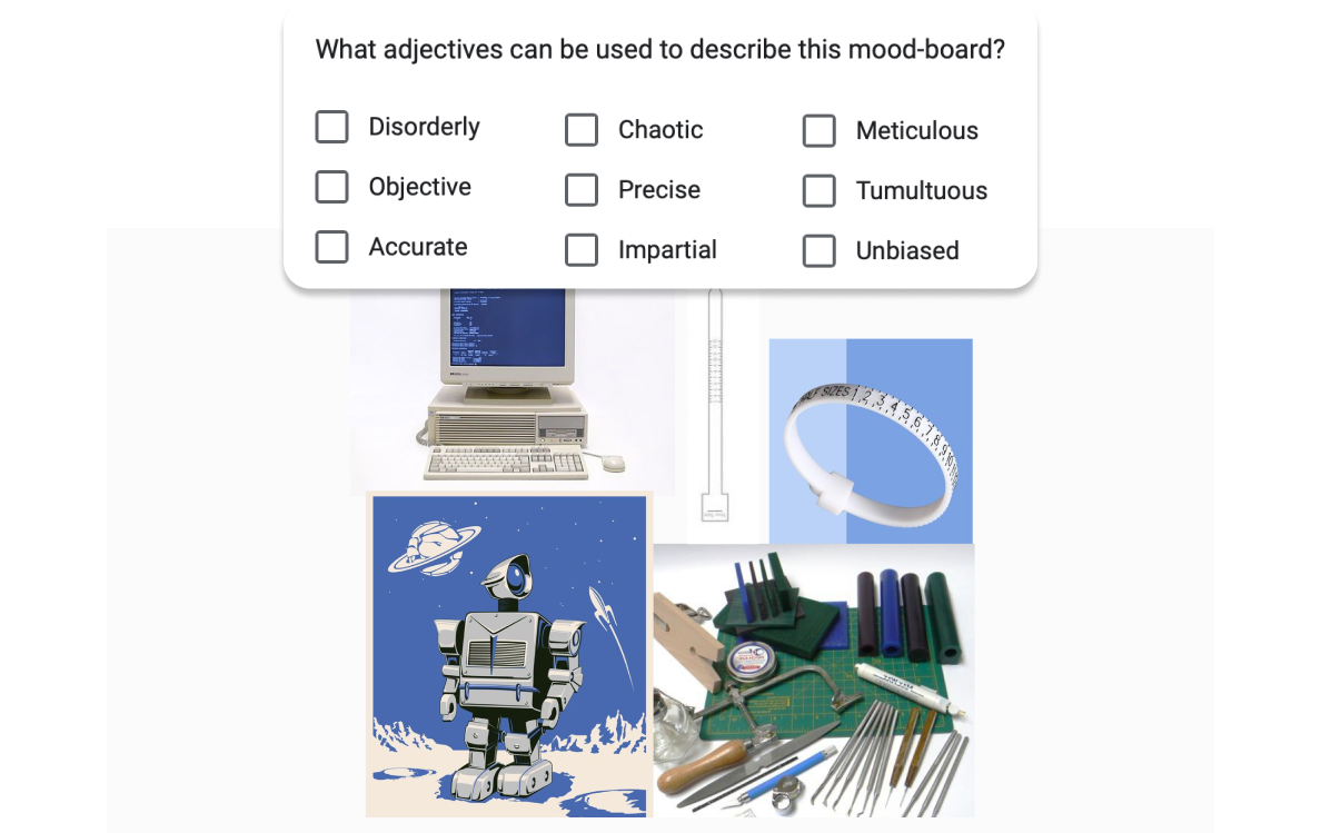
(c) Images: Pinterest - fairy use.
A well-structured Design System. is key to maintaining consistency and coherence across all aspects of an application, ensuring a seamless user experience.
on the image below, you can see the fully developed Design System. It includes a comprehensive set of visual guidelines, components, and interaction patterns that provide clarity and uniformity throughout the interface. This system serves as a foundation for scalable, cohesive design, ensuring that all elements work together harmoniously.
By establishing a consistent Design System, we ensure that the application not only looks polished but also functions intuitively across different use cases, reinforcing both usability and brand identity.
Logos are a central element of brand identity, and simplifying their design can make them more effective and visually appealing. Consistency in color and design is crucial for maintaining a clean and recognizable brand presence.
I updated the logo by aligning it with the same color system used throughout the design, ensuring consistency across the brand. Additionally, I removed any unnecessary and overwhelming design elements, creating a more streamlined and modern look.
By simplifying the logo and maintaining a cohesive color scheme, the design now feels more balanced and professional. This update strengthens the brand’s visual identity, making it more memorable and easier to recognize.

Result
Key learnings
In today's digital landscape, user experience is paramount. It is essential to create an interface that respects users' time and attention to foster satisfaction and engagement.
Copyright (c) 2024 Oksana Pravdina